Sunday, 11 April 2010
Message from Ms Prince
Your blog has now been marked for research and planning. Any subsequent evidence of research and planning work will not count towards your final grade.
Monday, 5 April 2010


Sunday, 4 April 2010


Monday, 29 March 2010
Preliminary Task


Before starting to produce the main cover of our magazine we learnt how to use photoshop by making a practice school magazine image
Evaluation: What have you learnt about technologies from the process of constructing this product?
Blog
- An account for the research and planning was all uploaded onto my blog including the complete magazine and evaluation. I had never used this sort of technology before and it was completely new to me but simply done. After some time I eventually learnt my way around the blog and managed to upload slide shows and other images.
Powerpoint
- I used Microsoft Powerpoint to create slide shows for my questionnaire results and some other evaluation questions. It helped me neaten up my Blog and separate the different sections within each question.
Studio images
- For the first time I used professional camera and the complete settings to take the photos of my models, this was an experience and I learnt how difficult and time consuming it can be to find and take one perfectly acceptable photo.
Adobe photoshop
- Adobe photoshop helped me create the four pages of my music magazine as well as the readers profile. Out of all the other technologies I found photoshop to be the most difficult one to use, however I did eventually get the whole concept and managed to experiment with it in order to create my magazine.
Slideshare
- Slideshare was completely unfamiliar to me and it helped me upload Powerpoint presentations onto my Blog, I found this very helpful and it was also very simple. I uploaded the presentations onto www.slideshare.com and then embedded the code given into my Blog.
Excel
- I used Microsoft Excel to make the graphs for my questionnaire results, it was not difficult as I am very familiar with it.
Evaluation: what kind of media institution would distribute your media product?
Evaluation: Who would be the audience for your media product?
 This is based on data from the questionnaire and audience feedback which was a part of research and planning that helped to make important decisions in the production process.
Evaluation: How does your media product represent particular social groups?
My music magazine attracts particular social groups by the use of language and images. The main target audience was generally aimed at people of the age 14 and above as R&B and Hip-Hop has huge likeability and age can not be specified too much.
- The social groups (target audience) is represented by what they would more likely prefer to see, by this I mean the questionnaire helped to understand how to represent the product to a wider audience.
- I would say that the magazine is targeted at both males and females but as the front cover is an image of a male, females may possibly be more interested, however this is not always the case as millions of males could also be drawn to the magazine due to idolising artists.
- By using props and specific costumes for the main artist, I represented particular social groups stereotypically. This was done by mimicry of other R&B or Hip Hop artists, superior poses are also used to represent the social groups that may be interested in the music artist.
- The magazine has also represented the younger audience by using an image of a young artist on the cover, as well as other images on the contents page whom are also young. This was done to show the fresh and edgy side of R&B as there are many young popular artists new to the music industry, such as Souljah boy and Lil Romeo who eventually grew to become very successful.
- My main article also appeals to specific social groups due to the informal yet mature language being used, also the content is seen to be highly worthy and the target audience is likely to find it interesting because the topics being talked about are common and popular.


Friday, 19 March 2010
Working Process
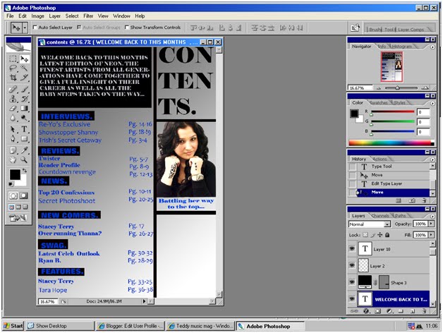
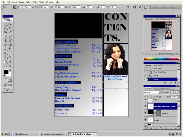
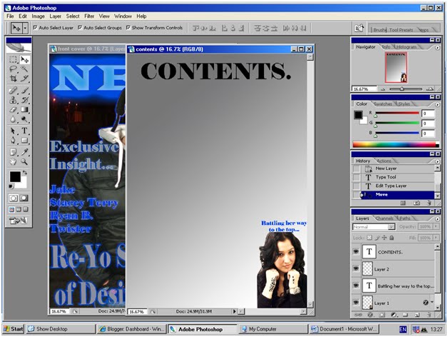
During the last several lessons I have been working on my front cover and contents page whilst making changes to the fonts and image positioning. It took me quite a while to make the background suit the main image and it involved a lot of adjusting. I started the contents page but eventually changed the complete image positioning and colours due to quick decision making. I asked people surrounding me for advise on what image the page gives to a public audience, nd using their response I made some changes in the process.


Wednesday, 10 March 2010
Working Progress
We started off designing a questionnaire to obtain information based of the public audiences view on music magazines, we then used some of the data to make important decisions concerning the name, genre and design of the magazine. We practised how to use photoshop by playing around with it in order to make a practice front cover of a school magazine and contents page. In addition, i experimented with the different types of fonts which linked in to the name 'neon', using a blue colour, after finding the right one i chose a background and main image after several complications including different opinions and blurry photos. Then I started the production process of the main cover of the magazine after analysing several covers and front covers.
Final image for front cover

I have chosen this as my main cover image because the modelis looking at the camera properly with sufficient eye contact involved, also it is the most clear photo taken compared to the rest of the images.
Rejected Photos

The model is occupied which makes them look busy and possibly popular, this image could be used as a smaller additional image in the contents page.


This picture is very blurry which makes it an unacceptable image to use for the main cover of my magazine.

The models face and eyes is not seen properly and this can not be used as eye contact is essential to complete the image.

The model is not looking towards the camera which makes it unusual to use to the cover.
Monday, 8 March 2010
Final Masthead Design
This is the final design for the masthead which we chose as the most appropriate because it was the most vibrant and bright design compared to the other templates. The name neon was finalised after a hard decision making process as the name of the magazine is a very important factor which had to be taken into account in terms of linking in with the genre.
The genre of the magazine is a mixture of R&B and Hip-Hop which is currently known to be mainsteam genres in the music industry and the definition of neon generally refers to the ignition of the 'vibrant' unique colours made by specific gases. Compared to different more dull colours, neon stands out and is noticeably brighter. Similarly to the genres of our magazine which stand out compared to other standards genres.

The genre of the magazine is a mixture of R&B and Hip-Hop which is currently known to be mainsteam genres in the music industry and the definition of neon generally refers to the ignition of the 'vibrant' unique colours made by specific gases. Compared to different more dull colours, neon stands out and is noticeably brighter. Similarly to the genres of our magazine which stand out compared to other standards genres.

Thursday, 4 March 2010
Targets
You need to show more evidence of work in progress i.e. screen shots of various stages of the construction of each magazine page. In addition, use the blog checklist to complete all other tasks.
Textual Analysis
Your research into similar texts shows real insight and a sound understanding of how presentational devices are used effectively to convey genre and target an audience - well done. You should now add an analysis of a main article.
Audience Research
Samira your questionnaire analysis is well presented and informative. Well done for using some of the responses to inform your production. You should now upload your focus group findings.
Wednesday, 3 March 2010
Ideas for masthead/font
I have experimented on different font styles to suit my magazine cover as the masthead. It was fairly difficult to make a neon effect and I have chosen the last font as our final design.


Background Ideas
For my front cover I wanted a dark background preferably all covered in black therefore I took photos of an vague environment in a low lot area. Here are some examples.


Monday, 1 March 2010
Conventions Of A Music Magazine
IDEOLOGY:
The music magazine must give the audience what they want to see and intake.
The main way to do this is to use the audiences likes and dislikes to produce the magazine but also including originality and extra aspects which are unique to its genre.
INSTITUTION:
The aim of the publishers is to make money and prices would depend on magazine contents, size, quality and audience in particular. They can also make money by advertising other products within the magazine from other companies, this can also cause a lot of competition.
LANGUAGE:
The text and language of the magazine must relate strictly to its target audience, however formal language is always necessary. The main image and masthead would also relate to the audience and relevance to the genre. Similarly, the stories within the magazine must relate to the ideology and must be entertaining.
AUDIENCE:
The institution must target a certain group as it is impossible to target everybody, it also depends on the genre of the music magazine. The target audience must be interested in the magazine and must be able to relate to its contents.
REPRESENTATION:
Artists must all represent the genre of the magazine in all ways possible, and all the representation must reflect the artists and audience, so people are interested in the magazine.
Sunday, 28 February 2010


Both the Q magazine and NME share similarities in the use of presentational devices. The mastheads are very similar in style because they are both red, black and white in the top left corner of the page. The mastheads symbolise the name of the magazine and the rich brand of Q and NME. This may connote the idea of whom the magazines target audience are, preferably Q/NME readers.
In Q there is a main image of three adult figures in reasonably smart clothing, in contrast to the rough rock look of the teens in NME. It shows the target audience for the magazine clearly, Q being for young adults and above, and NME being for teens. In NME the teens have a rough and more edgy look highlighting the main input feature type of the magazine.
In Q the main cover line is music based but formally written compared to NME. NME aims to advertise upcoming artists using informal language to attract the younger audience who are more likely to be interested in the magazine. The colour of the main cover line links into the theme colours of the magazine masthead; black, red and white. Whereas in Q the main cover line uses dull more mature colours and font styles.
The background of Q is plain white which is more sophisticated and fairly typical to older readers. This has a significant effect as the front page is the first thing customers become attracted to when purchasing a magazine. Therefore, people are normally appealed by designs more likely to suit their age or style.
The NME magazine has a more busy rough background as well as busy sell lines which include more images than in Q. This shows that NME aims to be more visually informative than Q, and Q is more likely to contain more textual information for readers to absorb.
NME covers a more niche audience whereas Q is mainstream and includes various types of genres that appeal to a wider range of audience. Both magazines also have puffs which are simple phrases that outline the success of the magazine. This is to promote the magazine further. However, both magazines effectively attract the target audience properly using the distinctive design of the front cover.
XXL magazine analysis
 I am going to analyse and evaluate the effectiveness that the front page of ‘XXL’ magazine has on their target audience. Firstly, the masthead 'XXL' is significant to the image of the magazine as if has a red background which symbolises wealth to most readers and the letters ‘XXL’ are formed by the image of diamonds which shows the content of the magazine of being rich, popular and highlights the use of 'bling'.
There is also a puff on the front page which advertises the magazine further as it shows the popularity of the magazine as well as superiority. It says 'a decade of dominance' and '10th anniversary, our biggest ever issue'. The first one would be very effective from a readers point of view as it shows that the magazine has been on-going for a decade and it still popular as it continues to impress old and new readers. The second puff appeals to customers purchasing the issue in particular due to the phrase claiming that it’s the best issue so far.
The main image and focal point of the front page cover is a mid shot of baby and Lil Wayne topless and wearing several long thick chains, which is expected to also be made of diamonds in similarity to the masthead. This shows great contrast with the background of the magazine, which is an image of a lower class looking bungalow. This roughly shows the artists roots in the way it differs from where they have reached now. The tattoos on their bodies show a sign of wealth because tattoos are fairly high priced. This is effective because it is highlighting the superiority which links into the genre of the magazine, as the genre is mainly Hip-hip and R&B, world known to be the mainstreams of the music industry.
The sell lines is a list of popular hip hop and rap artist names, arguably the most successful rap artists of our time, which attracts a much wider variety of people who are likely to buy the magazine, just to read the exclusive interviews based around one or more of the artists named.In conclusion the magazine has clearly portrayed the type of style and genre that is aims to show, through the wealth symbolising images and colour scheme used on the over.


Saturday, 27 February 2010
Focus Group Questions
These are questions for the focus group which help me find out what people would like to see in my music magazine.
1) Does the title 'Neon' appeal to you?
2) What colours do you think would suit a R&B music magazine?
3) What do you think the main article should consisit of?
4) What inspires you when reading a music magazine?
5) What is the most important feature of a music magazine?
1) Does the title 'Neon' appeal to you?
2) What colours do you think would suit a R&B music magazine?
3) What do you think the main article should consisit of?
4) What inspires you when reading a music magazine?
5) What is the most important feature of a music magazine?
Friday, 26 February 2010
Thursday, 25 February 2010
Existing Hip-Hop / R'n'B Mag Covers
Using the data that i collected from the basis of my questionnaire, me and my group partner came to a conclusion that hip-hop and R&B genres are the most favoured types of genre for the public, as well as them being most mainstream genres. Therefore I have decided to choose hip-hop and R&B as the genre of my magazine. As further research I have selected several hip-hop and r'n'b magazine covers to use as an inspiration and here are a few examples:


Subscribe to:
Posts (Atom)